
19/8/26 Mid week blog #228 - Explaining the 'Thumping' technique.

Ever heard of the technique called 'Thumping'? In today's post I explain exactly what it is & share examples.
Hello & welcome to my blog. I hope you are all well.
My name is Alison & I live in beautiful Melbourne, Australia & I am an independent Stampin' Up® demonstrator.
I love to create beautiful things to share with people that I love but I also sell me creations. I have been creating things in one way or another for most of my life - knitting, sewing, cooking, card making, gardening, scrap booking & hand made gifts & in 2020 after joining Stampin' Up® I decided to share my passion in a blog (craftedbyalison@blogspot.com).
In 2025 I retired & decided to spread my creative wings a little more by combining my blog, products that I had been selling on FaceBook & launching a newsletter. Some of these things I had already been doing but this time they are all in the one place. (All previous posts can be found at my blogspot address above if you would like to read any of them.)
There are many ways to make unique colour combinations & finishes. Thumping is one way that adds a subtle variation to stamping your images. To create this technique you first of all ink up your stamp with one colour then choose a darker coloured marker as a contrast. Holding the stamp block in one hand, you gently tap the marker across the image. When you're satisfied, stamp onto your cardstock, holding it for a few seconds to ensure that all of the ink is transferred. This technique will not work if you choose a dark colour & the darker the colour of the marker you choose, the better. Sadly, Stampin' Up!® no longer carry their Stampin' Write© markers but there are still many people, like myself, who have them in their stash. I chose to use the markers rather than the Stampin' Blends © that Stampin' Up!® still carry as it is not recommended to use the alcohol based Blends on your stamps to help keep them in good condition.
Here are some examples for you with tips on how the effects were achieved.

Thumping is a simple technique but if you want a little more colour variation in your projects then this may be the technique you need.
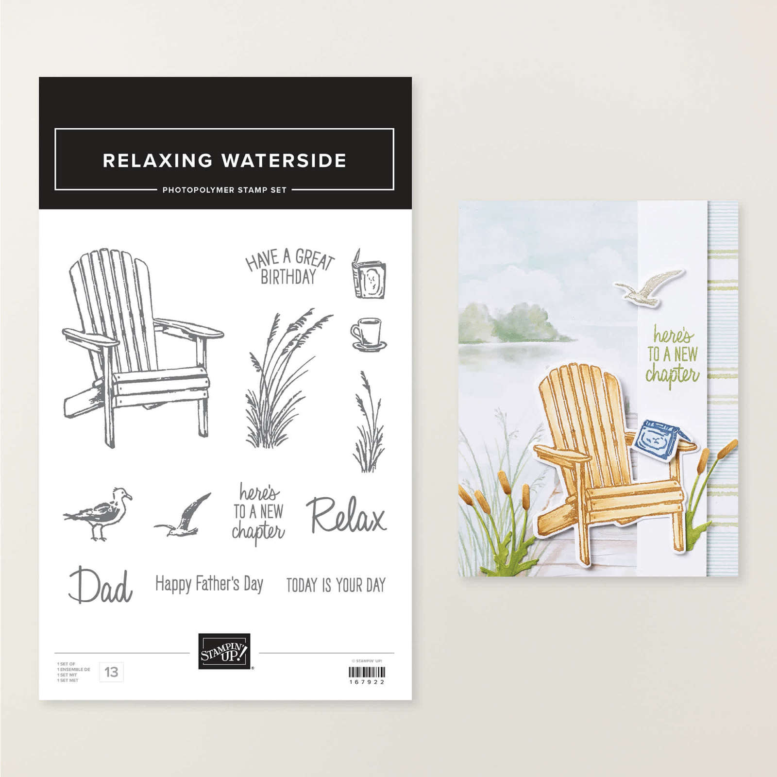
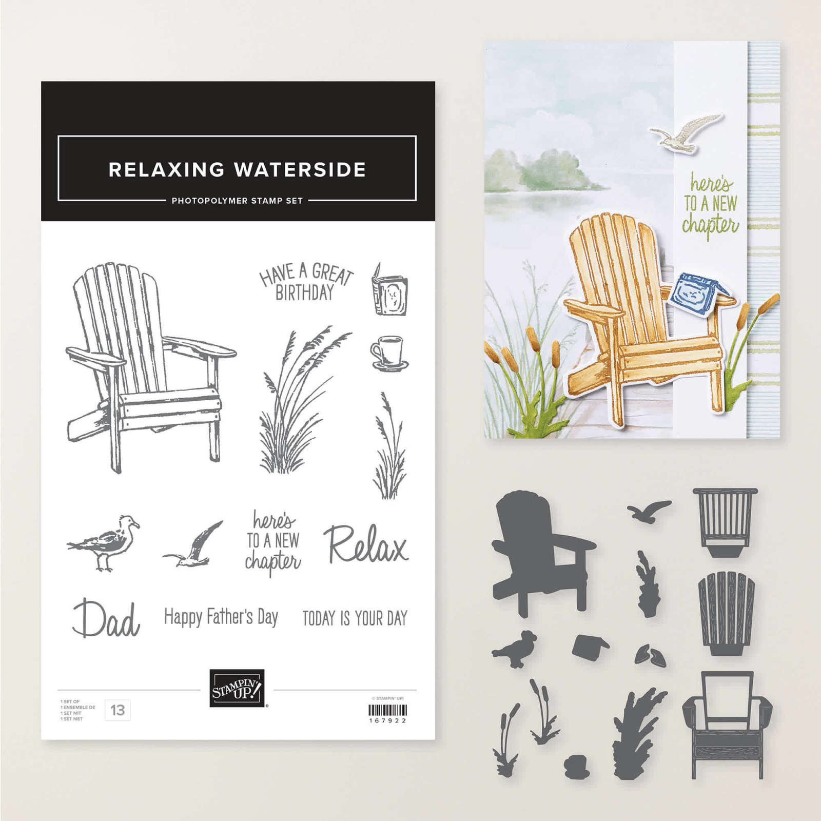
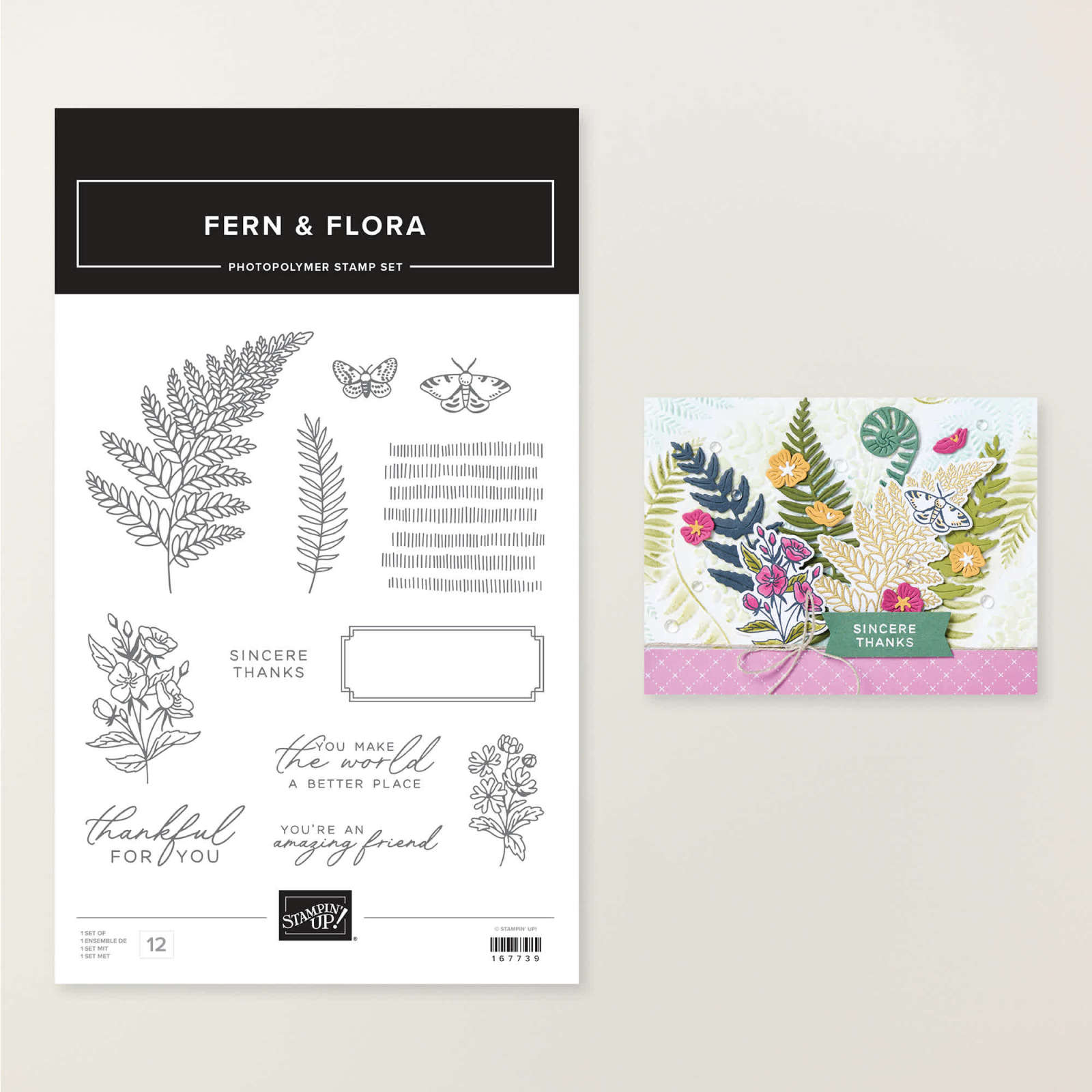
I chose two different styles of stampes, the Relaxing Waterside stamps for a Father's day card & Fern & Flora for a gender neutral birthday card.
Let's start with the Father's Day card (it's actually for my husband from my children but don't tell him! LOL)

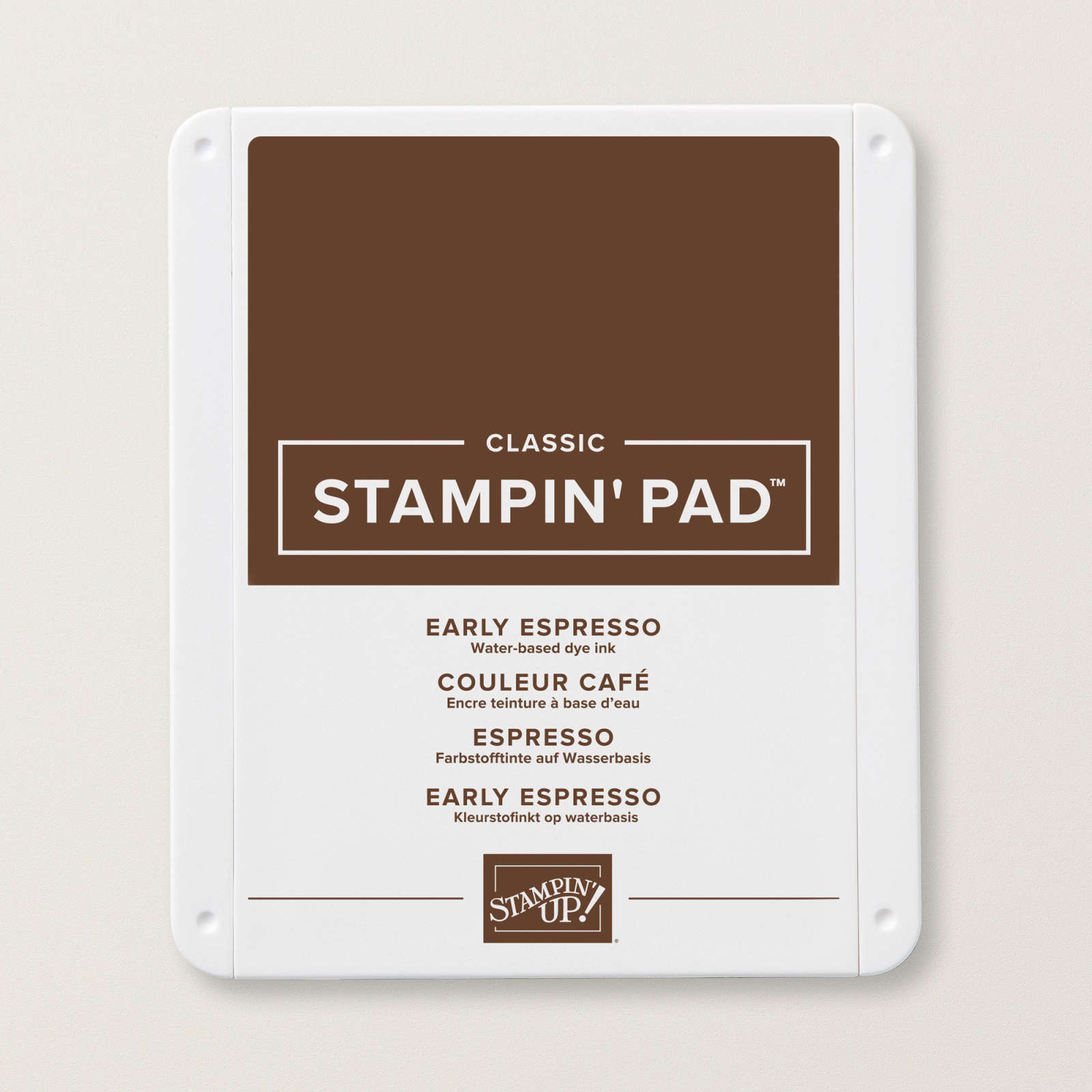
I started creating this card on Saturday at my monthly card group. I started with the chair from the set after inking it up with (retired) Soft Suede then, using the paintbrush tip of a Early Espresso Stampin' Write Marker, I tapped the side of the brush all over the image. When stamped there was a subtle variance which gives the chair a rustic look.

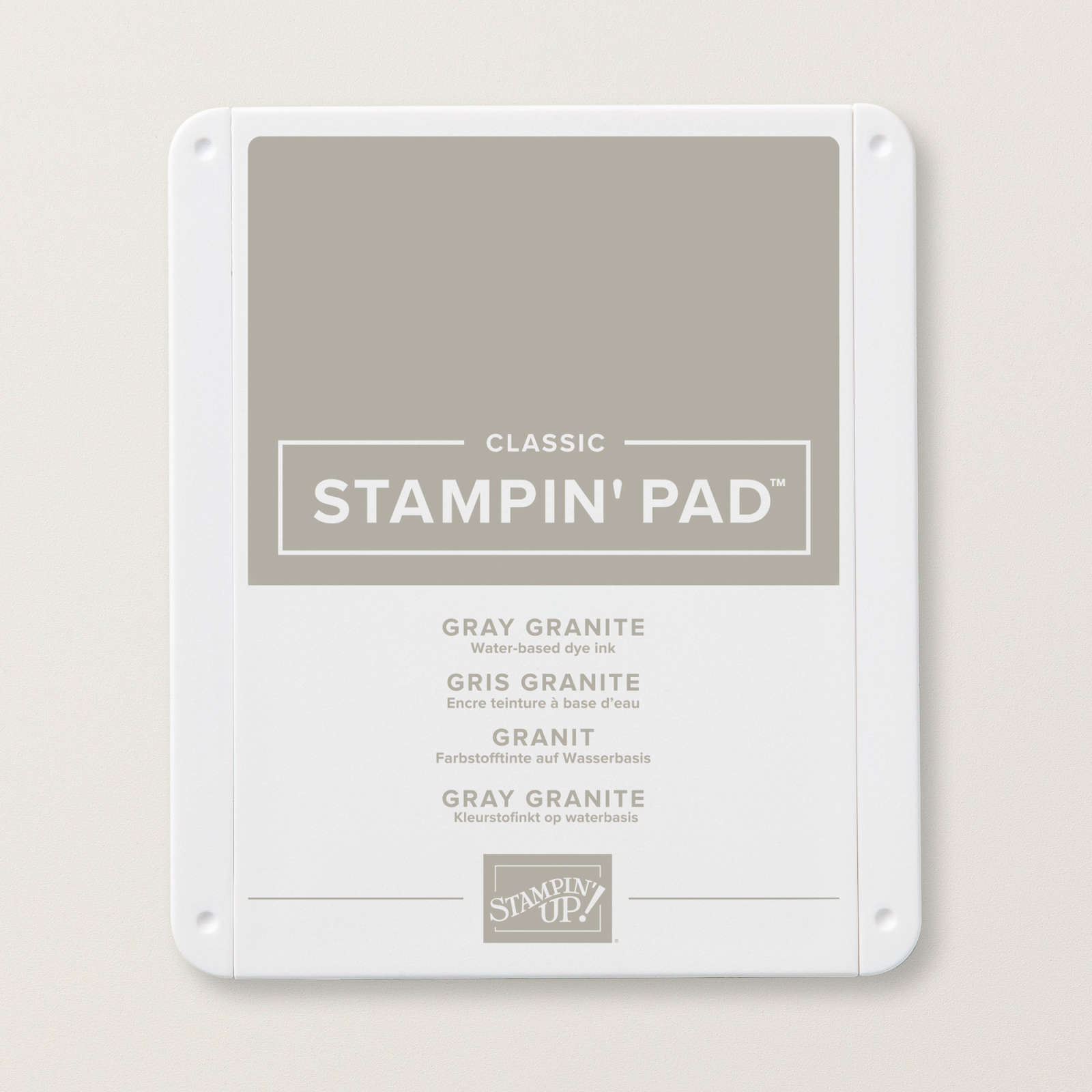
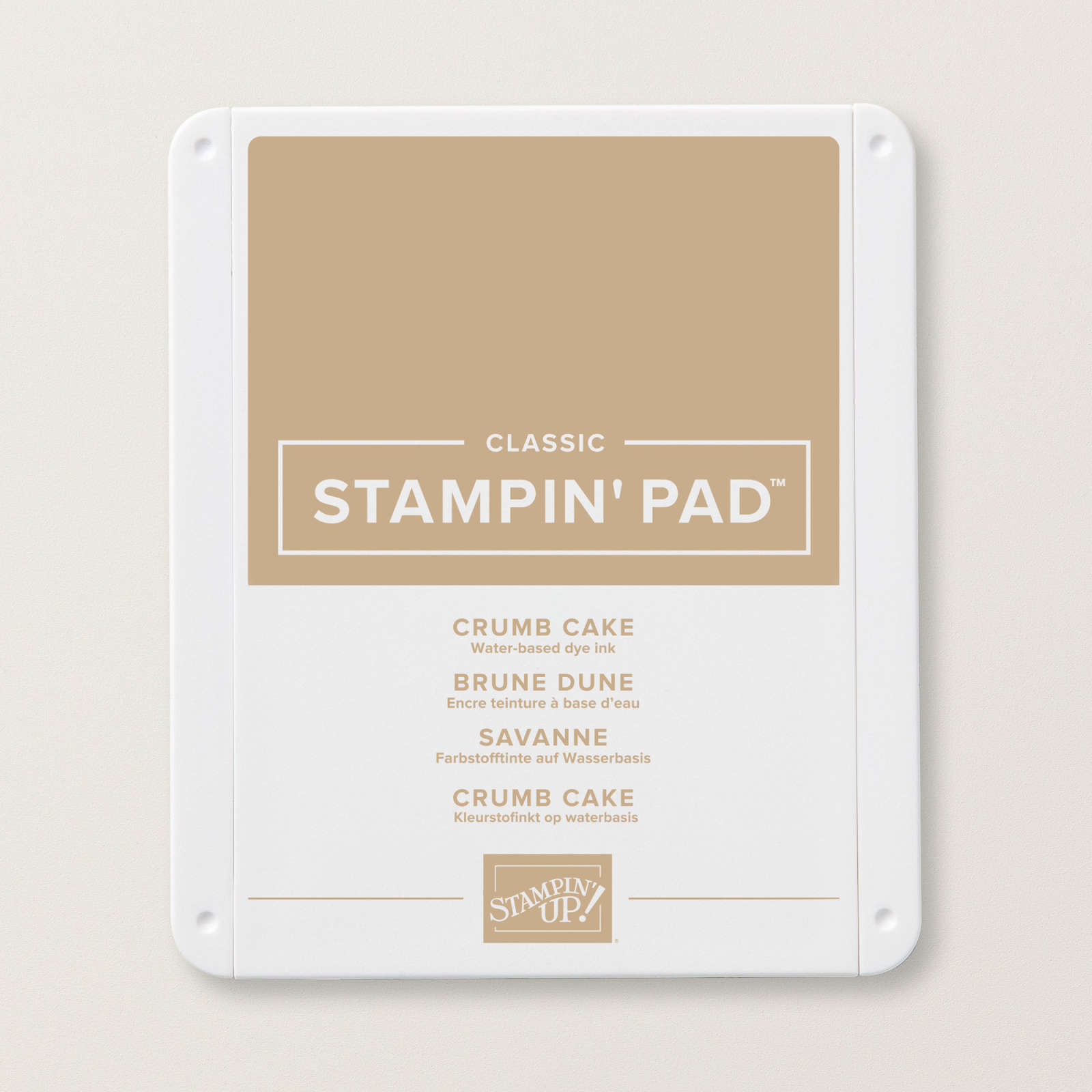
I stamped a number of these images, testing out different combinations including Crumb Cake & Basic Gray. One was also coloured with Crumb Cake marker.


Reeds were needed next to add to the card I imagined.
I used Crumb Cake as the base then 'thumped' Soft Suede & Mossy Meadow on the larger of the reeds & stamping the small reed in the same colours but omitted the green.

I diecut all of the images out & coloured in one of the chairs for a bit more depth.
I chose the co-ordinating Waterside Retreat DSP as a matte for the card front. I decided that the reeds didn't look quite right on the background so to add more detail to the card I stamped directly onto the DSP. I used the same colours as before for the reeds & added some Smoky Slate gulls with Gray Granite thumping & a sentiment in Early Espresso before adding it to the Gray Granite base with a Night of Navy matte.
I had some previously fussy cut images which were added around the chair, raising up the back of the life vest a little with a dimensional so that it leant against the arm of the chair.
The inside was a Night of Navy matte and a Basic White matte with some stamped images & the images were also added to an envelope for a complete co-ordination.

Now for the second card.

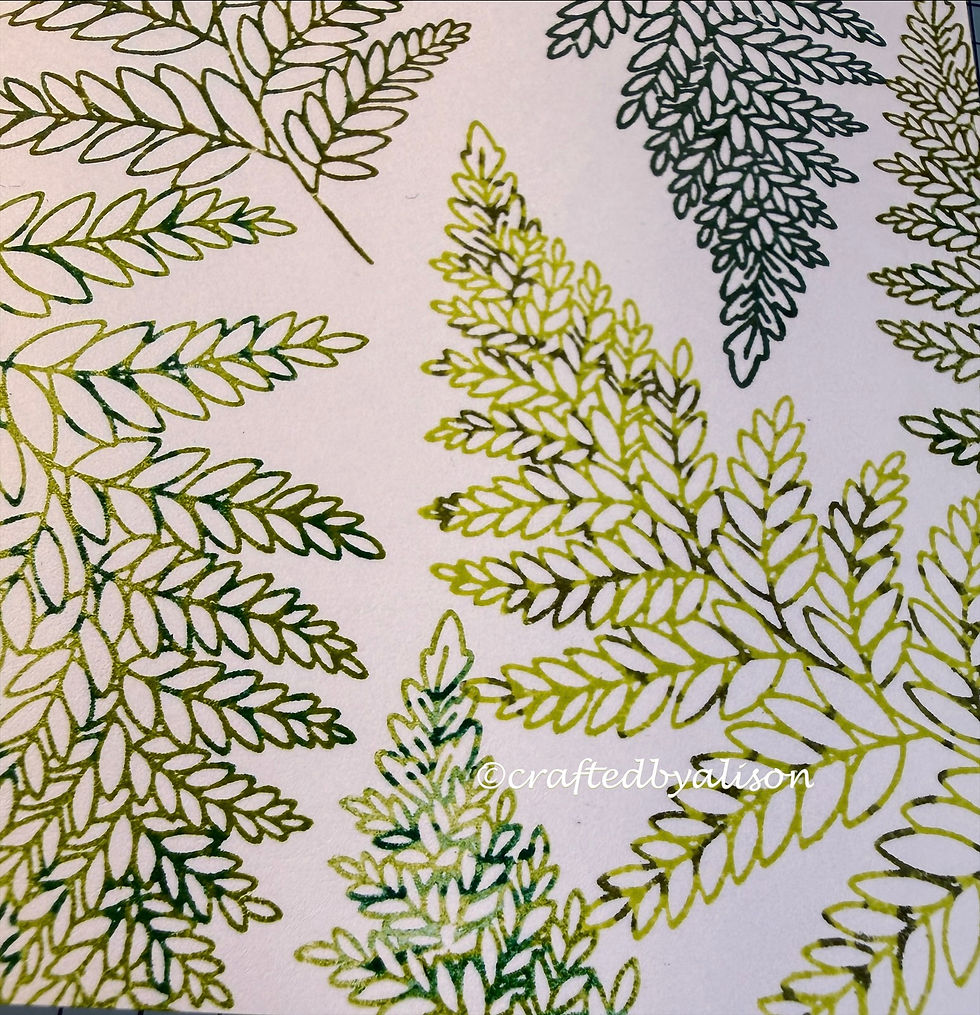
The colours on this one are more effective. I used 3 ink colours - Lemon Lime Twist, Granny Apple Green & Old Olive plus 3 marker colours - Shaded Spruce, Garden Green & Mossy Meadow.

Here are some closer views of the colours.

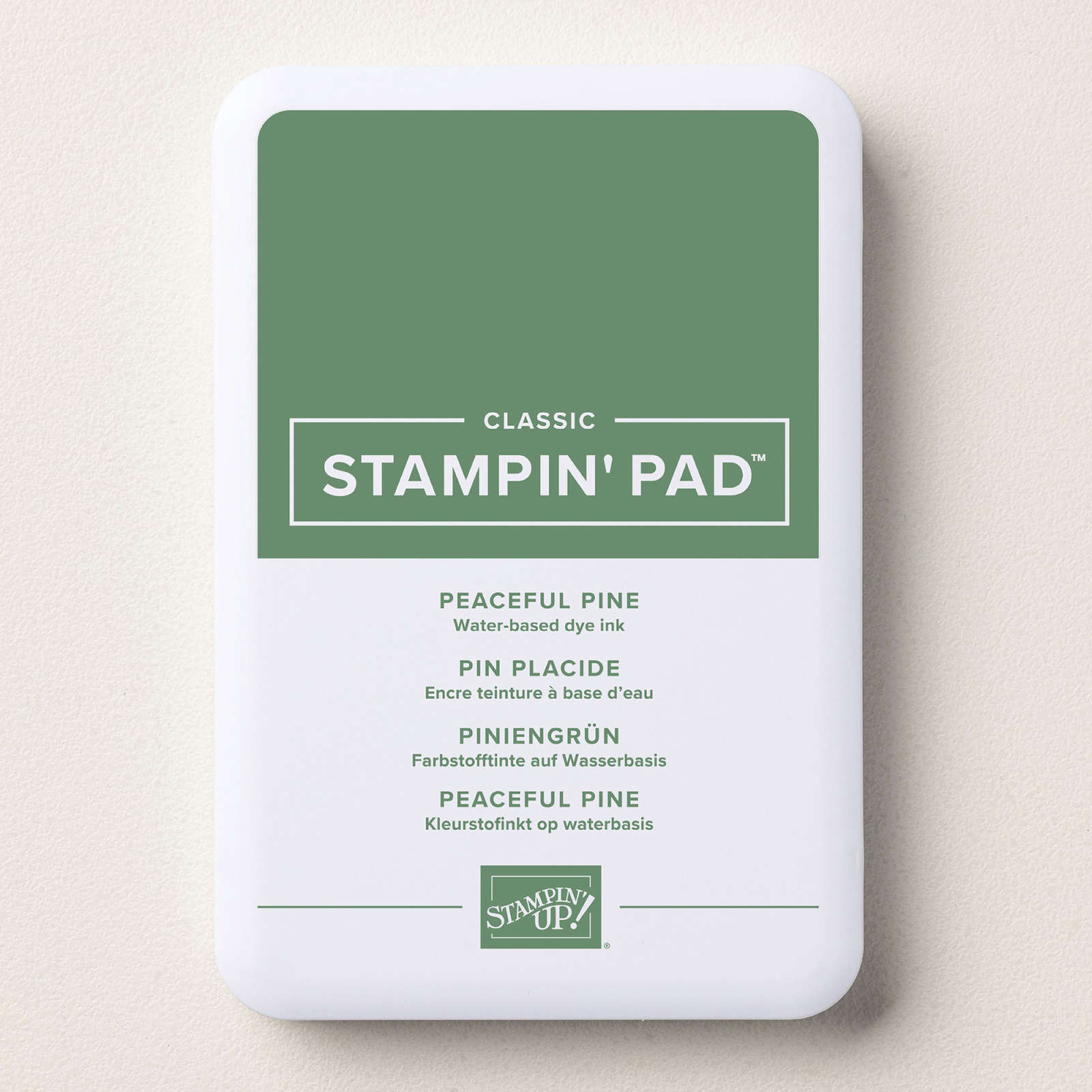
This was backed with some Peaceful Pine cardstock & added to a Basic White card base.
There is also a darker green leaf inked in Peaceful Pine which I 'thumped' with the Peaceful Pine Shimmer pen but the shimmer was too subtle & didn't show up as well as the other combinations
So, I covered it with the sentiment!

The sentiment is foiled in gold with the Classic Sentiments hot foil die. After diecutting it I adhered it to a Peaceful Pine scrap then fussy cut around it. It was then added with dimensionals.
The final touch are some Old Olive Moody Palette Glossy dots.
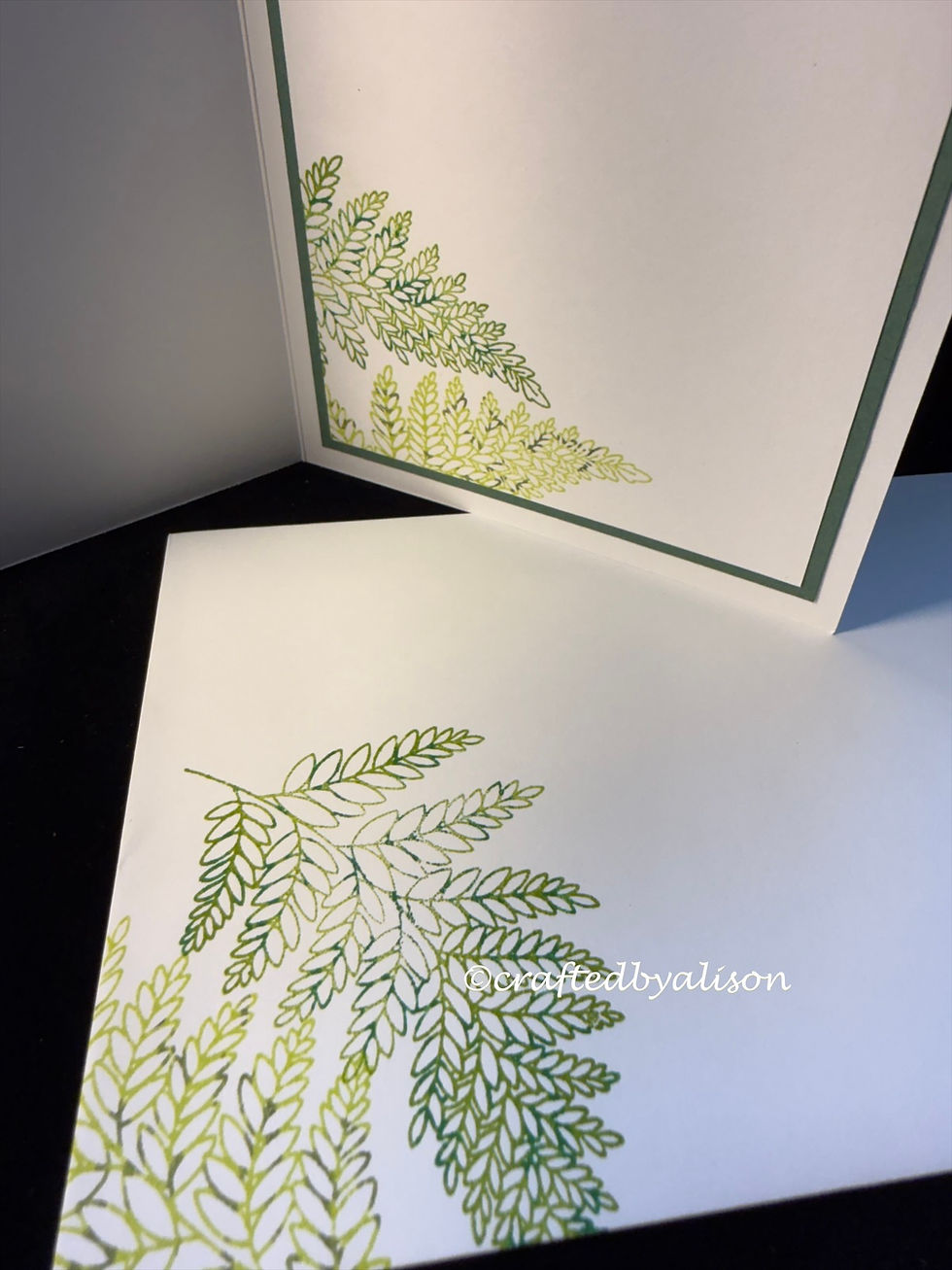
And of course the inside & envelope are decorated too!
So that's it for my post. I hope you enjoyed learning a different way to use colour. Perhaps you'll even give it a try yourself? Feel free to add your projects to my facebook page if you'd like to.
My next post will be on Sunday & features the latest Paper Pumpkin kit titled Aspens of Gratitude.
Next week's mid week post is a lovely, unique funfold.
I hope you can come back for both of them. At the end of this post I will put links to some of the products I used for my cards.
Til next time, take care & keep creating.
XX Alison
Stamps, Dies, Embossing folders & punches

Cardstock, DSP & paper


Inks & Markers
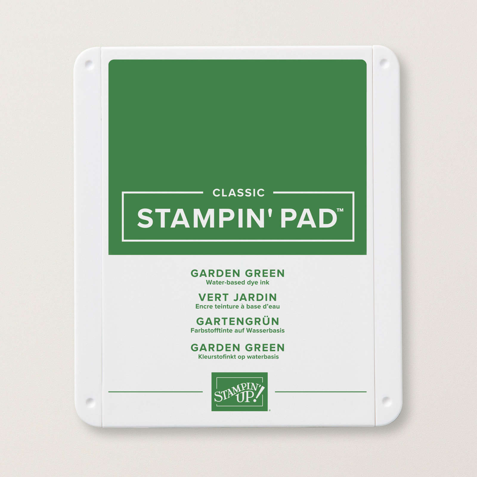

Lemon Lime Twist Classic Stampin' pad Sorry, the image link is not displaying for this item but the link is still working.

Embellishments

Adhesives
Tools


Comments